


Mobile website
Website on telephones and tablets
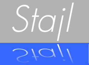
Nowadays you can design websites so they can be viewed on telephones and tablets as well.
This is called „Responsive Design“.
It means that a website adjusts itself to the device is is watched with.
Who has a monitor with full hd resolution of 1920 x 1080 pixel, becomes another layout as someone that looks at this website with a tablet with a resolution of 1024 x 800 pixel or a telephon with 320 x 480 pixel.
Webdesigner have the possibility to check what screenresolution the viewer has and then offer the fitting layout.
When you visit www.danner-stahl.at and make the woidth of browserwindow smaller and smaller , can view the effect life. The text that is on the right side at first jumps to the left or becomes a menu-item and the menu is reduced to an extendable bar for telephones.
On a screen of 1920 pixel width.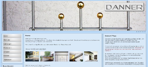
On a screen of 1280 pixel width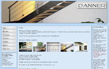
On a screen of 764 pixel (iPad) width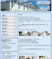
On a screen below 480 pixel width
With an expandable menu

Nicht jede Webseite muss als „responsive Design“ gemacht werden, manchmal ist es einfacher und logischer für Telefone einige eigene Seiten anzubieten denn meiner Meinung nach liest niemandem große Mengen Text mit detaillierten Bilder auf einem Telefon.
So ist für Taxi Gerhard eine kleine „mobile Webseite“ mit weniger Information und kleineren Fotos gemacht , hier zu sehen.
Wichtig ist zu bedenken, dass es immer mehr mobile Geräte gibt und man soll sich fragen ob und wie man diese Nutzer bedienen will.
Previous page: Content Management System
Next page: Web programs